
Data Visualization is more than just a pretty picture! As they say, a picture can paint a thousand words. It is one of the best ways of promoting products or services because of its power to grab attention when least expected and it is becoming more prominent in both business print collateral and online marketing.
Research shows that people prefer visual content to plain text. Just look at the growth of image-focused platforms like Pinterest and Instagram to see proof. These platforms draw attention to important data quickly and make it easier to remember than written content.
Google, Pinterest, and several other companies are investing in visual search technology. Images already account for 19% of searches done on Google, and sixty-two percent of millennials say they are more interested in visuals than any other new technology.
Visual Facts:
· 65% of people are visual learners
· 93% of all communication is visual
· Our brain processes visuals 60,000 times faster than text
· Color visuals increase the desire to read by 80%
· Consumers are 85% more likely to purchase after watching a promotional video
· Online posts with images produce 180% more engagement
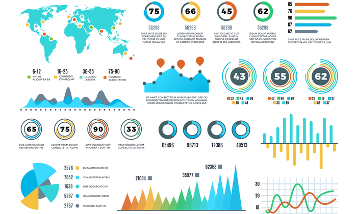
So, what are data driven visuals? They are attractive infographics, images, and videos that help your message to be better absorbed by creating aesthetic interest.
In order for your visual content to be successful, it must obey certain rules. Putting your data into a poor format can mislead your customer and kill your message. For instance, percentage data is often clearest when represented by a pie chart, trend data is often best displayed using a line graph, while comparing things against other things is often best done with a histogram.
Here are 10 rules to follow when creating your data visuals:
1. Colors
Keep it simple. Using too much color can cause confusion. A balanced mix of tones, the correct amount of saturation, and the right order of coloring is crucial.
2. Motion
Generally, people are more drawn to movement so why not use that by adding interesting motion graphics to your message?
3. Video
Videos should include an eye-catching presentation, long enough to pique interest but short enough to load quickly and not lose the interest of your audience. Less is more.
4. Kill Monotony
If you desire attention, you must abolish monotony. Be bright! Be bold! Let creativity take over your work and notice how different ways of presentation attract different types of people.
5. Quality over Quantity
Brands are often misled by the desire to include a large amount of content, rather than to have a smaller amount of high-quality content. This is a huge mistake to make. A smaller amount of great content is far superior to lots of mediocre projects.
6. Visual Strategy
You must maintain a good strategy for presenting your visuals and eye-catching content. Keep up with the latest trends in order to make your promotional message as effective as possible.
7. Consistency
Posting too much can have a negative effect on your brand, the same way not doing it enough can take viewers away from your work. Be consistent.
8. Information is Key
Keep your visuals as captivating as possible. Visual content is a colorful and fresh way of expressing ideas. However, when used for marketing purposes, it also has to be well organized and packed with pertinent information about your brand or product.
9. Authenticity
What attracts viewers is real and down-to-earth content. It will make you stand out. Make an extraordinary impact under ordinary conditions.
10. Looking Good
In the end, one crucial part of designing visuals is simply making them eye catching. The Power of Pretty is larger than you might expect.


